Published: February 8, 2004
Article originally published at http://www.nytimes.com/2004/02/08/weekinreview/08zell.html
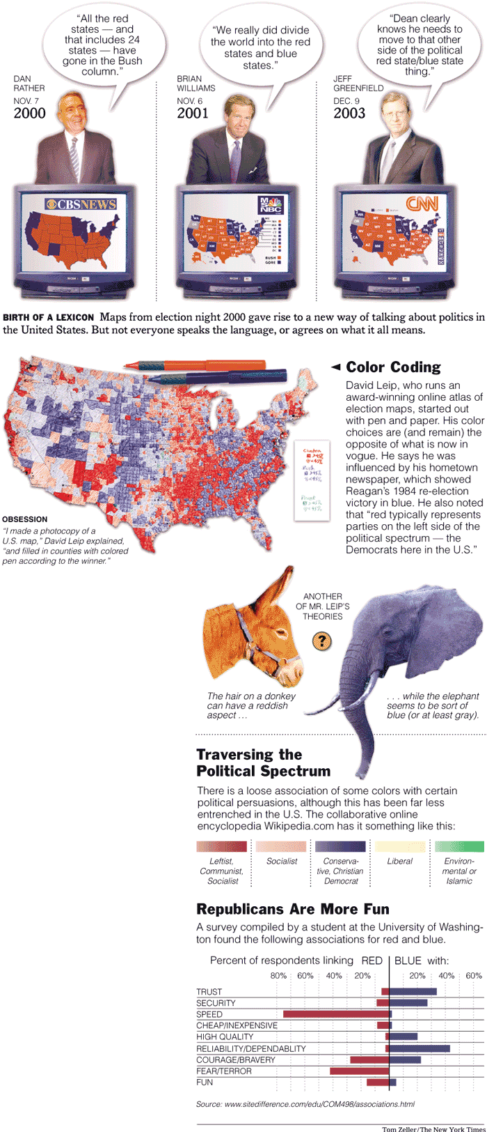
 N Dec. 19, the online magazine Slate corrected an installment of "Moneybox," a recurring column by Daniel Gross. The article had "reversed the states' electoral colors," the correction stated. "It's the blue coastal states that opposed Bush, and the red states that supported him."
The arbitrary, it seemed, had become axiomatic. Neither Mr. Gross's column, nor the correction, referred to a particular map. Instead, they both alluded to what has become, in the four years since the Bush-Gore showdown, something of a Platonic political tableau - one from which this simple, harmonic maxim now emanates: Democratic states are blue, and Republican states are red.
"I didn't realize it had become so official," said Mr. Gross, who also writes periodically for The New York Times. "I must have missed the memo."
There wasn't one, of course, but it is testament to the visual onslaught of the 2000 election - those endlessly repeated images of the electoral United States - that the Red State/Blue State dichotomy has become entrenched in the political lexicon.
"The red states have turned redder," the Bush campaign manager, Ken Mehlman, said recently, "while the blue states have turned purple."
To many, this palette represents an ignorant (or perhaps intentional) reversal of international tradition, which often associates red with left-leaning parties and blue with the right. "It's weird, is all," wrote a blogger at dailykos.com, a political Web journal. "I'd like some accountability if people are going to start messing with cultural symbolism willy-nilly."
Mark Monmonier, a professor of geography at Syracuse University's Maxwell School of Citizenship and Public Affairs and an expert in the use of maps as analytical and persuasive tools, found himself automatically reversing the current color code. "I remember talking in a class about the red states and blue states," he said, "and a student actually corrected me."
Online political discussion groups buzz with conspiracy theories about the maps, suggesting that Republican states were made red because that color typically represents the enemy on military combat maps, or because red has more negative psychological baggage (fiery, dangerous) than friendly, pacific blue.
Others have thought it simply a naÔve attempt to avoid trafficking in stereotypes (Democrats are Reds, or socialists). Professor Monmonier suggested - jokingly - that the red-left, blue-right association more rightly follows the conventional ordering of visible light (red, yellow, green, blue, and so forth).
But in the United States, at least, the color coding has rarely been static.
An early marriage of red and blue with the two major parties is noted in the Texas State Historical Association's Handbook of Texas History Online, which describes a color-coding system developed in the 1870's to help illiterate and Spanish-speaking voters navigate English-language ballots in South Texas. Local Democratic leaders called their party the Blues; Republicans chose to be the Reds.
By late in the next century, however, few were guided by that historical tidbit - or any other convention.
"It's beginning to look like a suburban swimming pool," the television anchor David Brinkley noted on election night 1980, as hundreds of Republican-blue light bulbs illuminated NBC's studio map, signaling a landslide victory for Ronald Regan over the Democratic incumbent Jimmy Carter. Other staffers, Time magazine wrote, called it "Lake Reagan."
Mr. Carter's bulbs were red.
Five years later, in her book "My Story," Geraldine A. Ferraro recalled watching her 1984 vice presidential bid founder on the television screen. Mr. Reagan's victory this time around was rendered in both flavors. "One network map of the United States was entirely blue for the Republicans," she wrote. "On another network, the color motif was a blanket of red."
By the 1990's, the color scheme was becoming a bit more formalized - at least on network and cable television. But other news outlets continued to vary.
Time magazine had favored Democratic red and Republican white in the 1976 election between Jimmy Carter and Gerald Ford, then reversed those colors for Reagan and Carter in 1980. By 1988, the magazine was using Republican blue and Democratic red, and it stayed with that motif even through the 2000 election, which has colorized the nation's political language in precisely the opposite way.
The Times, which published its first color presidential election map in 2000, followed the networks, although Archie Tse, a graphics editor who made the choice, provided a different rationale: "Both Republican and red start with the letter R," he said.
The National Atlas of the United States, published online under the auspices of the United States Geological Survey at nationalatlas.gov, still resists that trend: Bush counties are blue; Gore counties red.
Does it matter? Can swaths of cartographic-crimson or seas of ballot-blue tickle the rods and cones of the voting public and trigger deep-seated associations? The field of color psychology is uncertain on the matter.
Robert F. Simons, a professor of psychology at the University of Delaware and a co-author of a recent study titled "The Emotional Significance of Color in Television Presentations," published in the journal Media Psychology, says it is difficult to link colors directly with how much people like or dislike something.
"People still associate color with all sorts of things - red is hot, blue is cold," Professor Simons said. "But when all is said and done, these are semantic associations that probably have little to do with color per se."
But Leatrice Eiseman, the director of the Pantone Color Institute, says those semantic associations are fairly entrenched - at least in the West. Blue, Ms. Eiseman says, is cool and calming, and typically represents "those things in nature that are always there for us, like water and the sky," she said. Red, in contrast is "exciting, dynamic, high-energy."
"It can also be a symbol of danger and bloodshed," she added, although Republicans who find themselves uncomfortable at the hot-and-twitchy end of the spectrum may take comfort at the ascension of their color on Valentine's Day. "Red is also a very sensual color," Ms. Eiseman said.
She suggests that maps would do better to mimic the flag, with states bearing either stars on a blue field, or red-and-white stripes. "That would provide a symbolism that is familiar to everyone," Ms. Eiseman said.
Whatever the subliminal debris, the 2000 election, which kept the nation staring at tinted maps for weeks as the outcome remained uncertain, appears to have cemented a decision that once could be safely governed by whimsy. The Geospatial and Statistical Data Center at the University of Virginia, for example, once chose shades of green and turquoise for its election maps. "I suspect it was just what the mapmaker liked at the time," said Michael J. Furlough, the director of the data center.
But the center's maps for the 2000 election were made red and blue. "We made that decision so that the colors would match those that we thought viewers naturally associated with each party," Mr. Furlough said.
"A critical part of Dean . . . truly reflects much of the culture of the Blue States of America," wrote Andrew Sullivan in Time magazine last week. That's probably reason enough for the publication to cede to convention and render the Democrats blue this year. The magazine's managing editor, James Kelly, says it's already been decided. "We're getting with the program," he said.