Category Archives: Interesting Sites

UUorld GIS Software & Atlas Data

animated mapThe Atlas is partnering with UUorld (pronounced “World”) GIS software developer to provide election data in formats capable of being imported to the UUorld application. A link has been added to your myatlas page to the UUorld Export Script. All data sets purchased from the Atlas are available to you for export.

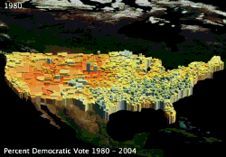
The application’s primary feature is the ability to extrude shapes in a three dimensional projection providing a geographic visual representation of relative data. 2-D mapping options are also available. One particular feature is the ability to produce animated time-series movies such the percent vote for Democratic Party Presidential candidates for the general elections between 1980 and 2004 (shown in this post). See some more examples of the Atlas data here. More data export options will be developed in the coming months. User feedback welcome.

*Update* UUorld is offering a $50 Rebate on the commercial version of UUorld with a receipt for an Atlas data purchase.

The Political Matrix

The Politcal Matrix is a mechanism to map and compare one’s political views in a two-dimensional space. Unlike the simple left/right (liberal/conservative) schema, the Political Matrix uses two axes, the right/left economic axis and the authoritarian/libertarian social axis. The two-dimensional map then places your result in one of four quadrants: authoritarian-right, authoritarian-left, libertarian-right, and libertarian-left (moderates would be points that fall close to the origin). Modeled after the Political Compass, and similar to the Libertarian diamond, the Atlas community has created and tested the new matrix to be a more detailed and accurate representation of one’s political philosophy. The Atlas community political matrix chart may be found here. Go ahead and take the test, add the results to your myatlas page and compare your philosophy with the community.

Bellwethers in Wisconsin

There is an article at the Milwaukee Journal Sentinel today titled Racine County voters seem to know how to pick ’em. The author, Tom Kertscher, contacted me and used the Atlas for his research. While Racine County is not a 100% bellwether like those covered on the bellwether page (Racine incorrectly voted for Gerald Ford in 1976), it did vote for the winning national candidate in every other election between 1960 and 2000.

Of Red and Blue

The New York Times has published an article titled One State, Two State, Red State, Blue State. It is an interesting read with regard to the recent adoption of the terminology of “Red States” and “Blue States” to refer to whether the states were won by the Republicans or Democrats in the 2000 election respectively. I was actually contacted by the author of this article last week with the question of how I chose my color representation for the Republicans and Democrats (However, I wasn’t actually quoted in the article). For readers of the forum or FAQ, the reasons are well known. From my point of view, the colors do not represent candidates or parties, but rather data (in this case, votes for a particular candidate). Looking at the maps from an analytical perspective, the meaning is discerned from the key and one should not get hung up on the selection of colors, for they are only a representation of the data and no other symbolism should be read into the presentation. I’m sure, however, that I will continue to receive copious quantities of email with regard to color selection.

New Map of American Politics

I’ve seen some chatter about the article at CommonWealth Magazine titled Beyond Red and Blue – The New Map of American Politics. The analysis divides the country into 10 political regions that cross state (but not county) boundaries – with all ten regions having approximately an equal number of voters (based on ballots cast in the 2000 general election). The article presents an interesting angle on the politics of the 2004 campaign based on the results of past Presidential Elections within these geographic regions. The article is long, but certainly an interesting read.

Electoral College Calculator

I was recently asked about a web-based interactive electoral college calculator. Such an application allows the visitor to dynamically color states “blue”, “red” (or “green”) to simulate various electoral college scenarios for one’s favorite candidate. I believe that this would be an excellent feature – one that could further be used in “what-if” scenarios of past elections. Unfortunately, I currently do not know how to implement such a feature. If you have knowlege in this area, please send me some tips.

In the meantime, there does exist an Electoral College Calculator at Gray Raven Ventures . This is an embedded java application. It loaded slowly on my machine, but once there was very responsive. It allows for four candidates (and they have chosen the media’s recent “standard” of blue for Democrats and red for Republicans). The map is a bit crude, but practical. It presently requires that one choose the state first, and then click on the party that you want to award its electoral votes to. This requires signficantly more clicks and mouse-movement to complete a scenario (a faster version would allow a user to choose a party and then fill all the states for that party). It also has an advanced feature to enter split electoral votes – if, for example, you would like to award one of Maine’s CDs to a different party from the statewide winner.

Perhaps the best feature is that you can manipulate this map to run “what-if” scenarios. On the left side is the ability to display the results from election (1789 through 2000). You may then change the winner of various states to see how this would have affected the outcome!

Update:Warning, This application locked my Netscape 7 browser and required me to reboot.

The Swing State Project

Here is an interesting site, called the Swing State Project. The site examines the swing states, defined as votes in 2000 for (Gore + Nader) – (Bush + Buchanan) < ±10%. They have used the data provided here for the determination of the swing states. Note the familiar map – and thanks for the compliment 🙂